Work, Worklessness & Benefits
Date
31 August 2017
Date updated
6 April 2020
Overview
The indicators in this topic look at the problems associated with not being in paid work, underemployment and insecure work.
Poverty and the amount of paid work carried out by adults in a household are closely related. As the figures on in-work poverty show, having an adult in employment is not a guarantee of having a good income. However, poverty is much more likely without employment or when working relatively few hours.
270,000 people were unemployed in London in 2016, which is the lowest level since the start of the recession in 2008/09. This is also the first year in which unemployment has been split evenly between men and women. Previously, the unemployment rate had been higher for men, partly because men who were not in work were more likely to be seeking work, and hence included in the figures. The unemployment ratio has decreased to 4.9% in London, which remains higher than the 3.8% unemployment ratio in the rest of England. The unemployment ratio looks at unemployment as a proportion of the working age population, as opposed to the economically active population. A quarter of the working age population in London were workless in 2016. 5 out of 6 of them were economically inactive (meaning that they were not looking for work).
The number of Londoners claiming an out of work benefit has been falling year on year, and is down to 470,000 in 2016. This has been falling faster in London than the rest of England. Only 41% of unemployed people in England were claiming Job Seeker's Allowance or Employment & Support Allowance in 2016, suggesting that the gap between benefit need and benefit receipt is widening. Only 8% of London households do not contain working adults, down from 15% in 2005.
Work, Worklessness & Benefits: Indicators
Out-of-work benefits
Out-of-work benefits over time
This graph shows the proportion of the working-age adults claiming an out-of-work benefit in London and the rest of England. This is based on their ‘client group’, and the main reason why they are claiming a benefit. This includes jobseekers, Employment Support Allowance and incapacity benefits claimants, lone parents and others on income-related benefits (for example carer’s allowance) and is shown by the lines on the graph. The bars show the proportion of the working-age population that are claiming one of the four main out-of-work benefits for London only. Universal Credit (UC) will replace all of the benefits shown when it is fully rolled out, a process expected to be complete by 2022. It has been included in the graph for 2015 and 2016 only, as before then the numbers of people who had been transferred onto UC were extremely small. …
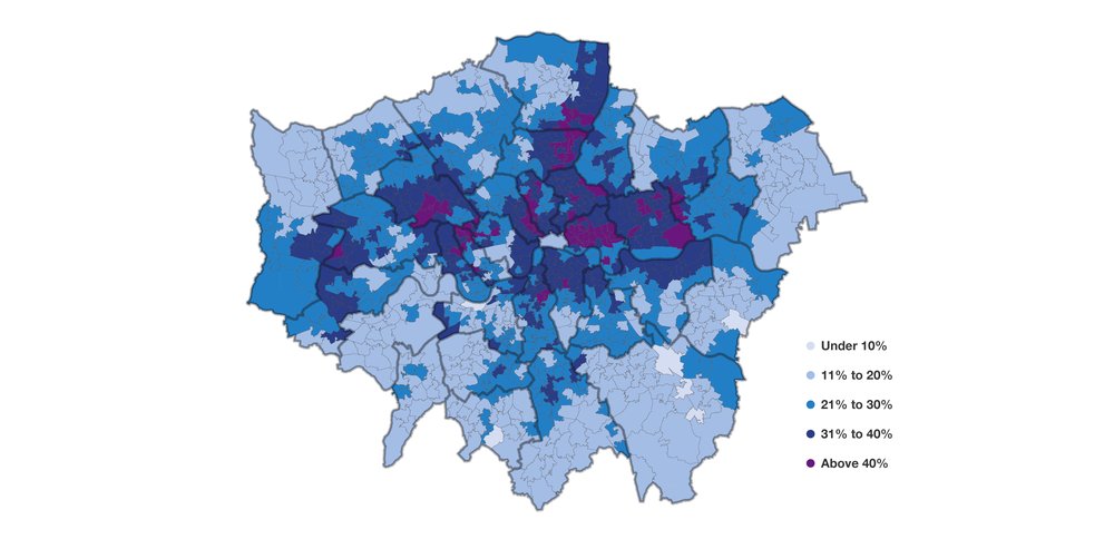
Out-of-work benefits map

The map shows the proportion of the working-age population claiming an out-of-work benefit* across London in November 2016. The boroughs of North East and East of London contain the highest concentration of wards with more than 10% of people claiming out-of-work benefits. Most boroughs have a mixture of areas with larger or smaller proportions of people claiming an out-of-work benefit. Hackney, Islington and Barking & Dagenham only have a few areas where less than 10% of the working-age population are claiming an out-of-work benefit. Some boroughs such as Barnet, Harrow, Hounslow, Kingston, Richmond, Merton and Sutton contain no areas where more than 10% of the working-age population are claiming an out-of-work benefit. These are all Outer London boroughs.
The 32 London boroughs, excluding the City of London due to lack…
Housing benefit
Housing benefit by tenure & work status
This graph shows the number of working-age housing benefits claimants by whether they are in the social or private rented sectors and by whether they are in work or not. Housing benefit is a means-tested benefit which helps those living in rented homes (both in the social and private sector) meet their housing costs. Those claiming an out-of-work benefit are automatically entitled but it can also be claimed by those in work on a low income and by pensioners.*
In 2017 there were 590,000 working-age families claiming housing benefits. The number of families claiming housing benefits has been falling since 2013, when it peaked at 680,000. The social rented sector accounted for 380,000 (or 65%) of claimants and the private sector for 210,000 (or 35%).
The area in which there has been a significant change is the number of housing benefit claima…
Council Tax Support
Council Tax Support
This graph shows the impact of the replacement of Council Tax Benefit (CTB) with Council Tax Support (CTS). From April 2013, local authorities across England were required to devise their own systems of CTS for working-age adults, and funding for it was reduced. It replaced the national system of CTB which provided support to low-income families to help with their Council Tax bill. Councils had to keep the previous system in place for pensioners.
The most common change that local authorities have made from the former CTB system has been to introduce a ’minimum payment’ which requires everyone to pay at least some Council Tax regardless of income. This graph shows how much more CTS claimants pay on average relative to the system of national support before April 2013.
Seven boroughs – Camden, Hammersmith & Fulham, Kensington & Chelse…
Overall Benefit Cap
Families affected by the overall benefit cap
This graph shows the number of households affected by the benefit cap, grouped by the weekly cut in their support. The cap was introduced in 2013, based on an annual equivalent of £26,000 a year, with a lower level for single adults without children (£18,200). In 2016, it was reduced further (to £23,000 or £15,410), and by a greater amount outside of Greater London.
In London, in 2017, the number of families affected was 15,300 compared with 8,900 in February 2016, an increase of 6,400.
In 2017, the largest single groups of those affected were families losing up to £25 per week and those losing between £25 and £50 a week, both at around 3,900.
Compared with 2016, the number in each category of cut has increased with the lowering of the value of the cap. In February 2016, there were 890 families losing more than £150 a week, rising to 1,4…
Benefit sanctions
Benefit sanctions over time
The number of JSA sanctions by age, the total number of ESA sanctions from 2009 onwards and Universal Credit sanctions from 2015 onwards. Benefit sanctions are imposed when a claimant fails to comply with the conditions of a benefit without a reason that the DWP finds acceptable. Thus they only apply to the parts of benefits with conditions attached, such as JSA, or the Work-Related Activity Group of Employment and Support Allowance (people in the work-related activity group are not expected to actively seek and apply for work, but they are expected to carry out some activities).
Under UC, they do not apply to the housing element of the benefit. They vary in length and severity depending on the benefit and why the claimant is being sanctioned. For JSA, 100% of benefit is lost for between four weeks up to a maximum of three years. Under ES…
Work status and income
Household work status and the income distribution
This graph shows the position of Londoners within the UK income distribution by several different work statuses. These are: whether they are in households where all adults are working full-time; all work but one or more is part-time; only some work; none work; or all adults are of pension age. Families where all the adults are working full-time are mainly found in higher income quintiles. However, more than 1 in 10 (13%) adults in the poorest 20% are in households where all adults are working full-time. Families where all adults are in work, but one or more are working part- time, are spread fairly evenly across the second, fourth and fifth quintiles with slightly more found in the middle 20%. There are fewer in the poorest 20% at 1 in 10 (10%). Households where some adults work and some do not are common across the entire distribution, …
Work status of London's households
Household work status over time
This shows how household work status has changed over time in London for families with at least one working-age (16 – 64) adult. The proportion of households where all adults are working has remained fairly constant over time, apart from during the recession. In 2016, 47% of people in London were in a household where all adults were working. In the past 20 years the only time this has dropped below 47% was from 2009 to 2013. During this period there was a substantial fall in the proportion of people in a working household, to 42% in 2012.
The proportion of adults in a mixed household, where only some of the adults are working, has increased over the past 20 years. It increased from 35% in 2001 to 44% in 2016. It increased during the recession to its highest level in 2012 and 2013. It has since fallen, but represents nearly half of all tho…
Unemployment numbers
Unemployed adults in London over time
This graph shows the number of unemployed men and women in London from 1992 to 2016. In 2016, there were 270,000 unemployed people in London, the lowest level since the start of the recession in 2008/09. The figure is down around 27,000 on the previous year.
The recent peak in the number of unemployed men was 230,000 in 2011, although the high point in this data series was more than 300,000 in 1993. At 136,000 in 2016, the number of unemployed men is at its lowest in this series.
There were 134,000 unemployed women in London in 2016, down from a peak of 190,000 in 2011. Unemployment levels for women have been fairly close to the numbers for men, something that is historically unusual in London. This is largely due to increased economic activity for women: previously they were more likely than men to be not working and not seeking work or a…
Unemployment ratio over time
Unemployment ratio over time
This graph shows unemployment as a proportion of the working-age population, (the unemployment ratio). This differs from the unemployment rate, which looks unemployment as a proportion of the economically active population.[1] In 2016, the unemployment ratio was slightly higher in London (4.9%) than the rest of England (3.8%). The ratio in Inner London in 2016 was 5.1%; Outer London was 4.1%.
These rates peaked during the recession at 7.8% and 7.3% for Inner and Outer respectively in 2011. They have since continued to fall, and further converged on the rest of England rate.
Over a longer time period, there has been a substantial convergence over time between London and the rest of England, mainly driven by an improvement in Inner London. In 1994, 11.9% of the working-age Inner London population were unemployed, a ratio that was substa…
Unemployment ratio by borough
Unemployment ratio by borough
The unemployment ratio is the proportion of the working-age population that is unemployed. This graph shows that the ratio has come down significantly in almost all London boroughs in a relatively short timescale. The exceptions are Kensington & Chelsea and Richmond, where there have been slight increases.
The percentage change in the unemployment ratio is drawn out in the graph below.
Unemployment by age
Unemployment by age
This graph shows the level of unemployment by age for both London and the rest of the UK. Unemployment is higher for 16 to 24-year-olds than for older working-age adults in both London and the rest of England. 9.4% of young adults in London are unemployed, compared with 3.6% of 25 to 64-year-olds. In the rest of England, the gures are 8.3% and 2.8% respectively. Young adult unemployment ratios have fallen quickly since 2013 in London and the rest of England, for London down from a peak of 13.9%. While unemployment for young adults in London is higher than in the rest of England by 1.1 percentage points, the difference is not as large as it used to be. Between 1995 and 2004 it was around three percentage points. The gap between the employment rate of 25 to 64-year-olds in London and the rest of England was smaller in 201…
Worklessness by ethnicity
Worklessness by ethnicity
This graph shows worklessness that is either unemployed or economically inactive by ethnicity in 2006 and 2016. It also shows the share of each ethnic group who are workless as a proportion of the total.
In 2016 the worklessness rate for all ethnic groups had fallen compared with 2006, with the exception of those of Mixed ethnicity. Those of Pakistani or Bangladeshi ethnicity had the highest unemployment rate in 2016 at 46%, a decrease of 11* percentage points from 2006. Worklessness was lowest among those of White ethnicity in both 2016 and 2006, at 21% and 26% respectively. Although the proportion of those of White ethnicity who are workless is low, because they make up the majority of the working-age population, they are also the largest share of the unemployed at 49%. This is lower than in 2006 when it was 54%.
The Mixed, Pakistani and…
Worklessness by country of birth
Worklessness by country of birth
Filter by:
This graph shows the proportion of working-age men and women who are workless (unemployed or economically inactive) by their country of birth. The countries shown are the ones with the largest populations in London. In all countries of birth apart from Ireland, including the UK, female workless rates are higher than for males. The differences between genders are explained by levels of economic inactivity rather than unemployment, which suggests that caring responsibilities are a reason for this disparity. There is, however, a large difference between countries. The female workless rate among those born in Afghanistan is 62 percentage points higher than for men, while it is 3 percentage points higher for those born in Jamaica, Germany and Italy. For those born in Ireland the female workless rate is lower than the male worklessness rate by…
Reasons for not working

This chart looks at the working-age adults in London who are not in work. There were 1.5 million workless adults of working age in London in 2016 which is one quarter (26%) of the working-age population. 17% of these workless adults are unemployed, meaning they are available to start working and are seeking work. The larger proportion of workless adults, 83%, is made up of those who are economically inactive, meaning that they are not available for work.
Women are more likely to be workless than men in London – 19% (570,000) of men are workless compared with 33% (980,000) of women. This is because of the large variation in the number of economically inactive men (440,000) and women (840,000). Those who were looking after the family or home contributed the most to this difference: 31,000 men and 340,000 women.
In London more t…
Underemployment over time
Underemployment over time
This graph shows the proportion of the working-age population who are unemployed, economically inactive but who would like to work, and working part-time because they cannot find a full-time job. This represents those who are not working ‘enough’ and who would like to work more. In 2016, 800,000 people, 13.6% of the working-age population, were underemployed. The largest group within this was the economically inactive who want to work. The underemployment rate has fallen for four consecutive years since its high of 17.3% (980,000) in 2012.
The unemployment rate was 5.4% in 2004, and fluctuated around this level until 2009 when it increased to 7% and remained high until 2012 when it was 7.1% (400,000). Since then it has fallen every year until its lowest rate of 4.5% (270,000) in 2016. This has been the larg…
Temporary contracts
Temporary contracts
This graph shows the number of workers who are on temporary contracts and the number of workers who are on temporary contracts who could not find a permanent position. It also shows the proportion of temporary workers who are involuntarily on temporary contracts and those on temporary contracts as a proportion of all workers in employment.
In 2016, the number of workers in London on temporary contracts was at an all-time high at 260,000. This is 55,000 more than in 2004 when the number of temporary workers was 200,000.* Despite the growth in workers on temporary contracts, the proportion of all workers in London who are on temporary contracts has remained remarkably consistent since 2004 when it was at 5.8%, nearly the same proportion as in 2016 when it was at 5.7%. The total number of workers has grown at the same rate as the number of t…
Insecure work by age
Insecure workers by age
This graph shows the proportion of employees aged 16 to 64 who are at risk of being in insecure employment by age group in London and the rest of England. Here we define the risk of insecure work as being on a zero-hours contract, in temporary employment, working for an agency, or some combination of these. It is important to note that this does not mean that all workers will experience these forms of employment negatively. This indicator also looks only at employees, and not self- employed workers who might be on a zero-hours, temporary or agency contract.
Since the recession the UK as a whole has seen a larger increase in insecure work than many other countries.* The Trades Union Congress found that the number of people in insecure work, which it defines as those working without guaranteed hours or baseline employment rights, increased …
Employment status and qualifications
Employment by qualification over time
This graph shows the proportion of the working-age population who are in employment, or unemployed and lacking but wanting work, by educational attainment.* Those who are lacking but wanting work are economically inactive and not available to work for various reasons (such as being a student or ill). They are not counted as unemployed.
In 2016 the employment rate for each group had increased compared with 2011. Among workers with a degree or equivalent, the employment rate was 86% in 2016 compared with 83% in 2011. For those with no or unknown qualifications the employment rate was less than half of this in 2016 at 40% and 38% in 2011.
The employment rate increased the most for those with A-levels or equivalent and those with other qualifications. For workers with A-levels or equivalent the employment rate increased by 6 percentage points …
Low-paid residents by borough
Low paid residents by borough
This graph shows the proportion of employees in each borough who are low paid. The overall proportion of jobs held by employees living in London that were low paid over these two years was 22% (730,000 low-paid residents); 19% (260,000) in Inner London and 24% (470,000) in Outer London. However, there was much variation between the boroughs, with these proportions ranging from 11% for Richmond upon Thames to over 30% for four boroughs. Taking the ten boroughs with the highest proportions of residents who were low-paid, eight were in Outer London.
In 2017/18, as in previous years, Newham had the highest proportion of residents who were low-paid at 32% (36,000 low-paid residents), though it has seen its low pay rate fall over the last few years. Brent, Enfield and Barking & Dagenham were all next at 31%. Brent had t…
Low-paid jobs by borough
Low pay by borough workplace 2018
This graph shows the proportion of jobs in workplaces in each borough that are low paid, regardless of where the employees doing those jobs live. The overall proportion of jobs in workplaces paid below the London Living Wage in London is 19.3%, or 790,000 low-paid jobs. Jobs based in London are less likely to be low paid than the jobs worked by employees living in London. The figure for Inner London is 13% (360,000 low-paid jobs) and for Outer London it is 30% (420,000). The lower proportion for Inner London reflects the large business districts such as the City and Canary Wharf, with highly paid jobs often taken by commuters.
Tower Hamlets and Islington have the lowest proportion of low-paid jobs at 11% each (26,000 and 21,000 low-paid jobs respectively). This is followed by Westminster (12%) and Camden (13%). These are all Inner London…
Low pay by ethnicity
Low pay by ethnicity
The proportion of employees of each ethnic group that are paid below the LLW and the share of low-paid employees that this represents.
Low pay rates vary substantially among ethnic groups. The low pay rate for Bangladeshi and Pakistani employees, at 46%, is more than double the rate for White British employees at 19%. Those from Other ethnic groups and Black/African/ Caribbean/Black British have the next highest rates of low pay, at 37% and 35% respectively.
The ethnic make-up of the working-age population means that the low-paid workforce as a whole looks different from what the numbers above might suggest. The largest group of low-paid workers are White British who make up 34% (310,000) of the low paid. This is a reduction on several years ago and the last London Poverty Profile report, which reflects that the proportion of employees wh…
Low pay by industry
Low pay by industry
The proportion of employees in each industry who are paid below the LLW and the share of low-paid employees that this represents.
Some sectors have a much higher proportion of low-paid jobs than others. The proportion of employees who are low paid is extremely high in the hospitality sector (hotels and restaurants) at 64%. The industry with the second highest proportion of low paid workers is retail and wholesale at 41%. Transportation and storage and private sector services* have the lowest proportion of employees who are low paid, at 4% and 10%. Some private sector service jobs are well paid such as financial and insurance activities and professional, scientific and technical activities, while some are generally less well paid, such as administrative and support work.
Overall there are a large number of jobs in retail and wholesale, so…
Low pay by disability
Low pay by disability
The low pay rates for disabled and non-disabled people by full-time or part-time work and by level of education. In all cases disabled people are more likely to be low paid: 37% of disabled people compared with 27% of non-disabled people. The difference between the low pay rate for disabled and non-disabled adults is smaller for full-time employees than for part-time employees. Of those who are working full-time, 25% of disabled people are low paid compared with 19% of non-disabled people, a six percentage point difference. However, of those who are working part-time 62% of disabled people are low paid compared with 54% of nondisabled people.* This is an eight percentage point difference.
The pattern is the same when looking at education. Of those with A-levels or above 25% of disabled people are low paid compared with 20% of non-disable…
Weekly earnings
Real weekly earnings - London
The proportion of employees by real gross weekly earnings category. This means that weekly earnings have been adjusted for inflation (using CPIH)* so that it is possible to compare weekly earnings in 2016 with those 10 years ago in 2006. This graph includes both part-time and full-time employees. Part-time employees are generally concentrated towards the bottom of the weekly earnings distribution, due to both fewer hours of work and lower average hourly pay rates. In 2016 in London the median for all employees was £537 and for England –including London – the median was £442.
In 2016 in London, there was a smaller proportion of employees earning more than £600 than in 2006, and there has been an increase in the proportion of employees earning less than £600. This is also true in the rest of England but the change has been less marked.
57% –…
Low-paid men and women
Low-paid men and women
The number of low-paid jobs by whether they are part-time or full-time and by whether they are held by men or women. In 2016 the biggest group among the low paid were female part-time employees at 220,000, or 31% of the total. Male full-time jobs were the next biggest group (200,000, 27%), followed by female full-time jobs (170,000, 24%). The smallest group with just under a fifth of the total (130,000, 18%) were male part-timers.
The number of low-paid jobs increased over this period by 250,000. There was an increase in the number of low-paid jobs across full- and part-time work for both sexes. The increase in low-paid jobs has not been evenly distributed across the groups shown in the graph, however. The overall increase in the number of low-paid workers between 2011 and 2016 was 52%. For full-time men the increase was 61%, for full-ti…
Low pay by qualification
Low pay by qualification
The proportion of workers who are low paid by qualification level comparing 2011 with 2016. The risk of low pay for employees is lower for those with higher levels of qualifications. In 2016 just over 1 in 10 (13%) employees with a degree or equivalent were low paid whereas for those with no or unknown qualifications the proportion was 7 out of 10 (71%). Those with a degree or equivalent are by far the largest group of employees, they alone are more than half (55%) of all employees. So although this group has a low proportion of low-paid employees, they account for 260,000, 27%, of low-paid employees. Those with no or unknown qualifications only account for 3% of total employees and makeup 9%, 120,000, of those who are low paid.
The proportion of workers who were low paid increased for those at every educational level between 2011 and 20…
What is poverty?
Low income thresholds
Filter by:
The poverty measure typically used in this report is being in a household with an income below 60% of the median. This is adjusted for household size and is after taxes such as income tax and Council Tax. The table below puts these poverty thresholds in the context of similar concepts. For example, a working-age couple with an income below £288 a week before removing housing costs (or £248 after) is considered to be in poverty. On an annual basis, this is equivalent to around £14,980 for this family type before housing costs (BHC), or £12,890 after housing costs (AHC).
However, when members of the public are asked what income is needed to have a socially acceptable minimum standard of living (MIS – Minimum Income Standard – a different concept to poverty), the values are quite a bit higher: £351 a week in Inner Lond…
Poverty over time
Poverty over time
Filter by:
This graph looks at the changing picture of poverty in London. On average in the three years to 2015/16, 27% of people in London were in a household in poverty after housing costs (AHC). This is equivalent to around 2.3 million people. 21% of people were in households in AHC poverty in the rest of England.
On this after housing costs measure, the poverty rate in London has fallen slightly: down two percentage points from 29% in 2007/08. The number of people in poverty in London have been largely unchanged over the last six years, although this is in the context of a growing population. Between 2008–11 and 2013–16, the increase was less than 20,000 and not statistically significant.
The BHC measure includes housing benefits as income and does not deduct rent. In London, where housing costs are higher, housing benefits can make u…
Disability and poverty
Disability and poverty
Disability is strongly associated with poverty, both because disability brings with it extra costs which reduce the resources available relative to non-disabled people, and because it often reduces the capacity to work. This graph shows the poverty rate for people in families with and without a disabled adult in London and the rest of England. It also shows the share of all people in poverty who belong to such a family (see bars on right hand side).
The poverty rate for people in a family with at least one disabled adult is higher in London than for those without by nine percentage points at 34%. This is also higher than the poverty rate for those in families with a disabled adult in the rest of England, which is 26%.
However, despite the higher poverty rates for families with a disabled adult in London, they make up a smaller share of pov…
Poverty by age
Poverty by age
Filter by:
This looks at poverty rates for children, working-age adults, and pensioners in 2003–04 to 2005–06 and in 2013–14 to 2015–16. It uses poverty measured after housing costs (AHC). It splits this by Inner and Outer London, London overall, and the rest of England.
In the three years to 2015–16, 37% of children, 24% of working-age adults, and 19% of pensioners were in poverty in London. In numbers this is 700,000 children, 1.4 million working-age adults, and 200,000 pensioners in poverty.
Compared with a decade earlier, the proportions of both children and pensioners in poverty are lower. The child poverty rate has fallen from 41% to 37%, and the pensioner poverty rate has fallen from 21% to 19%. Despite this, because of population growth, there are now around 90,000 more children in poverty and an unchanged number of pensioners. The proportion…
Work and poverty
Work and poverty
This graph looks at poverty by age and family work status. In the three years to 2015/16, the largest single group in poverty were adults in working families, at 830,000, followed by 540,000 adults in workless families in poverty. There were also 480,000 children in working families in poverty, compared with 220,000 in workless families.
These numbers have changed dramatically over time. Compared with a decade earlier, there are 270,000 more adults in working families in poverty, and 180,000 more children in working families in poverty. Their workless counterparts have fallen by 20,000 and 110,000 respectively. Some changes were more drastic in the preceding decade: the number of pensioners and adults in workless families in poverty fell considerably to 2005–06, but has fallen less since. If we look over just the last five years, there ar…
Poverty and working hours
In-work poverty and work intensity
This indicator looks at the proportion of people in poverty by the family’s work status. The number of hours worked by members of a family is important for determining whether they are likely to be in poverty or not. Families in which all adults were working full time had the lowest proportion in poverty at 8%. In contrast, those with only part-time employees in the family had the highest rate, with 45% in those families in poverty. Families with a self-employed member also had a relatively high poverty risk at 28%.
Over the last 10 years, the proportion of people in every working family type in poverty has increased. It has increased most for those with one full-time employee and one adult not working (six percentage points) and families with a self-employed adult (five percentage points). There has been less change in the last five year…
Poverty and housing tenure
Housing tenure and poverty
This graph looks at the number of people in poverty in each housing tenure over time. In the three years to 2015–16, 960,000 private renters, 810,000 social renters, and 490,000 owner-occupiers were in poverty. As a proportion of the total for each group, this means 39% of private renters, 46% of social renters, and 12% of owner-occupiers were in poverty.* This was a remarkable shift in poverty tenure in London, given that the private rented sector’s poverty numbers were still the lowest of the three in 2007–10.
These three tenures have followed different trends in the last few years. In the last five years, there has been a negligible change in the number of social renters in poverty, an increase of 160,000 private renters in poverty, and a fall of 130,000 owner-occupiers in poverty.
There was a large increase in private…
Child poverty and housing tenure
Children in poverty by housing tenure
This graph looks at which housing tenure children in poverty live in. Over the three years to 2015/16, there were around 300,000 children living in poverty in the private rented sector, and 290,000 living in poverty in the social rented sector. There were far fewer living in owner-occupation, at 70,000.
However, the numbers of children in poverty in each of these tenures have followed very different trajectories. The number of children in poverty in the social rented sector fell to 240,000 in 2009–12, but has since increased again. In contrast, there were fewer than 100,000 children in poverty in private rented accommodation in the late 1990s. Since 2004–07, this number has roughly tripled.
The number of children in poverty in owner-occupation has been falling in recent years, by around 40,000 since 2011–14.
Expressed as a proportion, over …
Children and material deprivation
Child material deprivation
Figure 3.10 looks at the proportion of children in households in poverty unable to afford each item on the basis of cost. We are interested in this because, although the basic income poverty measure can account for housing costs, other costs that are higher in London do not feature.
One way of rectifying this problem is by looking at ‘material deprivation’, which is the state of being unable to afford several basic items as a result of cost. A household is considered materially deprived if it has a ‘score’ above a certain value. Lacking an item contributes to the score, and the more common a lacked item, the higher the score attached to it. Overall, 530,000 or 28% of all children in London were materially deprived. This rate has fallen from 32%, the figure both five years earlier and a year earlier. In contrast, 20% of children in the res…
Poverty across London
This map shows poverty rate estimates (after housing costs) for areas known as middle-layer super output areas (MSOAs). These are relatively small areas with a population of around 7,500. These statistics are experimental and so should be considered as indicative rather than definitive, but reveal interesting trends.
The first is how much of London has poverty rates above the rest of England average of 21%. Only areas at the edge of London south, east and northwest are below this figure.
The second is the concentration of poverty in traditional areas such as in Tower Hamlets, Hackney and Newham. Although this series of reports has documented poverty shifting out of Inner London, the most concentrated areas of high poverty are still there and in the north east.
There are also noticeable pockets of high poverty rates in areas o…
Pay inequalities across England
Regional pay inequalities
This graph looks at gross weekly earnings across the regions of England, at the bottom 10% and the top 10%, and the ratio between these. It also features the ratio for just full-time jobs.
In 2016, a job at the bottom 10% paid £166 per week, compared with £1,190 for a job at the top 10%. This gives a ratio of 7.2, i.e. earnings towards the top of the labour market are 7.2 times higher than those towards the bottom. This is below the ratio for the South East and East of England: in these regions, pay at the top is lower than in London, but pay at the bottom is disproportionately low relative to this.
The inequality between the bottom and top 10% is less pronounced if we examine only full-time jobs. London is also the most unequal region on this basis, with a full- time job at the top 10% paying 3.8 tim…
Changes in pay inequality
Change in pay across the distribution
This graph examines the change in pay at the bottom 10%, top 10% and middle of the earnings distribution for all jobs after inflation, measured using the CPIH.* The most notable feature across England between 2011 and 2016 is the strong growth in weekly pay at the bottom of the earnings distribution.
In London, earnings at the bottom 10% increased by 10% over this five-year period after inflation. In contrast, earnings at the median fell by 4% and earnings at the top 10% fell by 6%. London was the only region in England to have falling pay at the middle of the distribution, and also had the largest fall at the top. The region with the closest experience to London over this period was the South East, which had the second largest fall at the top 10% at 4%, and largely unchanged real median earnings.
This period inc…
Low-paid Londoners over time
2018 LOW PAY BY RESIDENCE OVER TIME
This graph shows the proportion of full-time, part-time, and all jobs that are held by Londoners and are paid below the London Living Wage over time. The most recent London Living Wage is £10.20 an hour. This graph assesses whether people are low paid or not based on their hourly earnings.
In 2018, just over one in five employees (22.5%) were low paid. This is an increase on 2017 and follows two years in which the proportion of Londoners who are low paid has fallen. The proportion of Londoners who are low paid has now increased back to the levels seen before the introduction of the government’s ‘National Living Wage’ in 2016.
The number of Londoners paid below the London Living Wage was 760,000 in 2018, an increase of 60,000 on 2017 and the highest number of low-paid employees recorded.
Previously, between 2010 and 2015, there had be…
Low-paid jobs in London over time
2018 WORKPLACE LOW PAY TIME SERIES
This graph shows the proportion of full-time, part-time, and all jobs that are paid below the London Living Wage and are based in London. Jobs based in London are not necessarily undertaken by London residents – for example, many well-paid jobs in London are worked by those who commute into the city.
In 2018, the proportion of jobs based in London that were low-paid was 20%, around 820,000 jobs. This figure was 12% (400,000) for full-time employees and 47% (400,000) for part-time employees. These figures do not sum due to rounding.
This represents a one percentage point increase from 2017, and means the proportion of jobs in London paid below the London Living Wage is now higher than it has ever been. Between 2015 and 2017 the rate did not change and remained at 19%. Before this there were several years of steep increases: between 2010 an…
Changes in weekly earnings
Change in weekly earnings in London and England
This graph shows the percentage increase in real weekly earnings between 2015 and 2017, using September 2017 prices for the pay distributions in London and England. This covers the period just before and after the introduction of the government’s National Living Wage in April 2016. The figures are for London residents.
Weekly earnings growth has been strongest at the bottom of the distribution in both London and England. The employee at the bottom 10% and bottom 20th of the distribution in London earned 5% and 7% more respectively in 2017 compared with 2015. In England as a whole, these figures were 7% and nearly 6% respectively.
The increases in weekly earnings are generally lower the further up to the distribution in London. Earnings increased by 1.4% at the median in London, compared to 1.7% in England.
London has seen stronger r…
Child poverty by borough
Child poverty rates by borough
This graph gives estimates of the percentage of children living under the poverty line in each borough between October and December 2015. Tower Hamlets has by far the highest rate of child poverty – 6 percentage points above the second highest borough, which is Islington. On the other end of the scale, Richmond has the lowest rate of child poverty in London, 6.5% below the next lowest Borough – Kingston (not counting the City of London).
Child poverty is significantly higher in Inner London than Outer London. The 6 boroughs with the highest rates of child poverty (and 9 of the top 10) are all in Inner London. All 9 of the boroughs with the lowest child poverty rates are in Outer London (excluding the City of London). Barking & Dagenham is the Outer London borough with the most children living below the poverty line. Wandsworth is th…
Change in low pay by borough
Change in low pay (over 3 years)
This data compares the proportion of workers who were low paid in 2015-16 as a two year average and those who were low paid in 2017-18 as a two year average. It shows by how many percentage points this figure has changed.
Pay inequality by borough
Pay inequality
This graph shows pay inequality in each London borough by comparing the ratio of top and bottom pay. It compares gross hourly pay for the top 20% with the bottom 20% in each borough. The higher the pay ratio, the more unequal earnings are in that borough.
The pay ratio in Tower Hamlets is 3.33, significantly higher than any other borough. This means that in Tower Hamlets someone just in the top 20% has pay 3.33 times higher than someone just in the bottom 20%. Hounslow has the next highest ratio, with 2.88, followed by Westminster with 2.76. Therefore in these boroughs, hourly pay for the top 20% of earners is much higher than for the bottom 20%.
The most equal borough by this measure is Croydon, where the pay ratio is 2.29, followed by neighbouring Merton where it is 2.31, and Wandsworth where it is 2.33.
The difference between bor…
Out-of-work benefits by borough
Proportion of working-age population receiving out-of-work benefits
This graph shows the proportion of working-age people in each London borough receiving an out-of-work benefit. These include: JSA, ESA and incapacity benefits, lone parent and other income related benefits.
The three boroughs where the highest proportion of working-age people were claiming an out-of-work benefit were Barking & Dagenham, Hackney and Islington. 10% of working-age people in these boroughs were claiming an out-of-work benefit (or 1 in 10).
At the other end of the scale, only 4% of working age people were claiming an out-of-work benefit in Sutton and Richmond (or 1 in 25).
These figures are only relating to out-of-work benefits, so do not include other benefits such as Child Benefit or Disability Living Allowance. This figures do not include Universal Credit which is being rolled out unevenly across London. This means …
Council Tax Support by borough
Loss from council Tax Support by borough
This graph shows the impact of the replacement of Council Tax Benefit (CTB) with Council Tax Support (CTS) in London local authorities. From April 2013, local authorities across England were required to devise their own systems of CTS for working-age adults, and funding for it was reduced. It replaced the national system of CTB which provided support to low-income families to help with their Council Tax bill. Councils had to keep the previous system in place for pensioners.
The most common change that local authorities have made from the former CTB system has been to introduce a ’minimum payment’ which requires everyone to pay at least some Council Tax regardless of income. This graph shows how much more CTS claimants pay on average relative to the system of national support before April 2013.
Seven boroughs – Camden, Hammersmith & Ful…